- Year ↑
- Category
- Project
- Client
- Agency
- Year
- Category
- Editorial
- Project
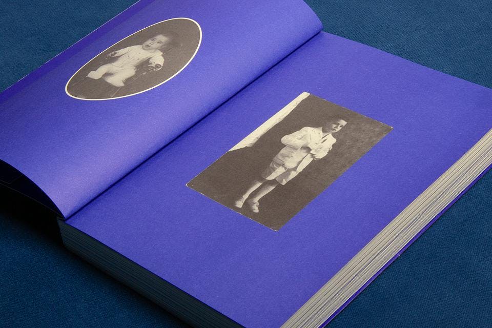
- Doce olhar para a vida
- Client
- José Augusto Trópia
- Agency
- –
+View projectThe design project for the autobiographical book Doce Olhar para a vida navigates through the stories and photographs using cutting, pasting and coloring resources. This combination creates an affective and poetic visuality referring to old photo albums and almanacs. Two different color were used for printing: black and Pantone Blue 072U...
- Year
- Category
- Poster
- Project
- Pequena Coleção
- Client
- Grupo Teatral Encena
- Agency
- –
+View projectThere is an intriguing story that says that Charles Darwin placed a live beetle in his mouth because he had no more room in his hands to carry it. The beetle defended itself by releasing acid in his tongue. This fact is told in the play and serves as a metaphor to speak about the power of words, the living force of a sentence coming out of someone's mouth, the importance of manifesting itself. After that, I started to look out for a real beetle to recreate that scene...
- Year
- Category
- Editorial
- Project
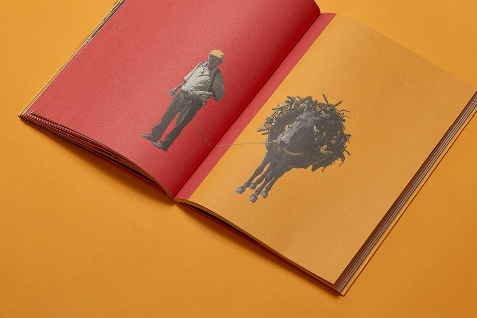
- Meu Mercadinho
- Client
- Grupo Atrás do Pano
- Agency
- –
+View projectThe editorial project navigates the text and photography contents using cutting, pasting and coloring resources throughout the book. The objective is to create a graphic-poetic visuality that gently and enthusiastically honors a community rich in unique characters, life stories and symbolic elements. For the graphic printing, a combination of three Pantone colors was used...
- Year
- Category
- Visual Identity, Poster
- Project
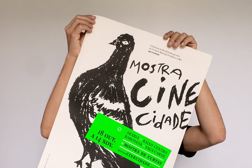
- Mostra Cine Cidade
- Client
- Mostra Cine Cidade
- Agency
- –
+View projectPôster impresso, pôster animado, lambes, peças digitais, website e bolsa para a Mostra Cine Cidade, um evento audiovisual que conecta pessoas, promove atividades de formação, fomenta a difusão do cinema mineiro. Para a identidade visual, elegemos a pomba como um símbolo: uma ave tida como ordinária e sempre presente em todos os ambientes urbanos, do centro à periferia. Todo o repertório visual, impresso e digital, foi criado a partir de uma série de ilustrações em pastel posteriormente digitalizadas..
- Year
- Category
- Editorial
- Project
- Dançando com as Palavras
- Client
- Paula Gotelip
- Agency
- Estúdio Lampejo
+View projectThe images were created from a combination of manual embroidery by artist Carol Grilo, pencil and charcoal drawings, digital illustration and the shapes of the typographic face Graúna (Typeoca). Thus, the images in the story speak to characteristics that are normally associated with people with dyslexia, such as learning kinesthetically, which is a different way the brain interprets letters, numbers and sounds. The book was printed entirely in three Pantone colors which, when combined, ensure legibility and make the images easier to understand...
- Year
- Category
- Authoral
- Project
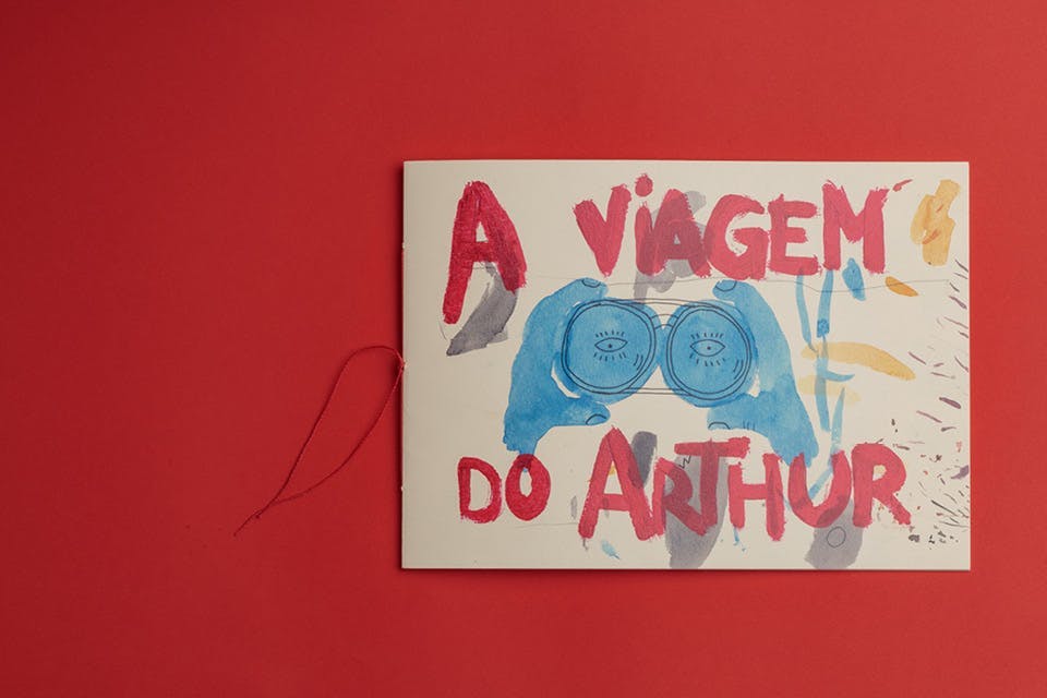
- A viagem do Arthur
- Client
- –
- Agency
- –
+View projectA viagem do Arthur tells the story of a boy who, at night, hunted shooting stars. The illustrations are composed of mixed techniques: watercolor, acrylic paint, colored pencils and oil pastel. Written by uncle Vini and illustrated by uncle Fil, the book is the result of a free experimentation of drawing and literature techniques for children...
- Year
- Category
- Editorial
- Project
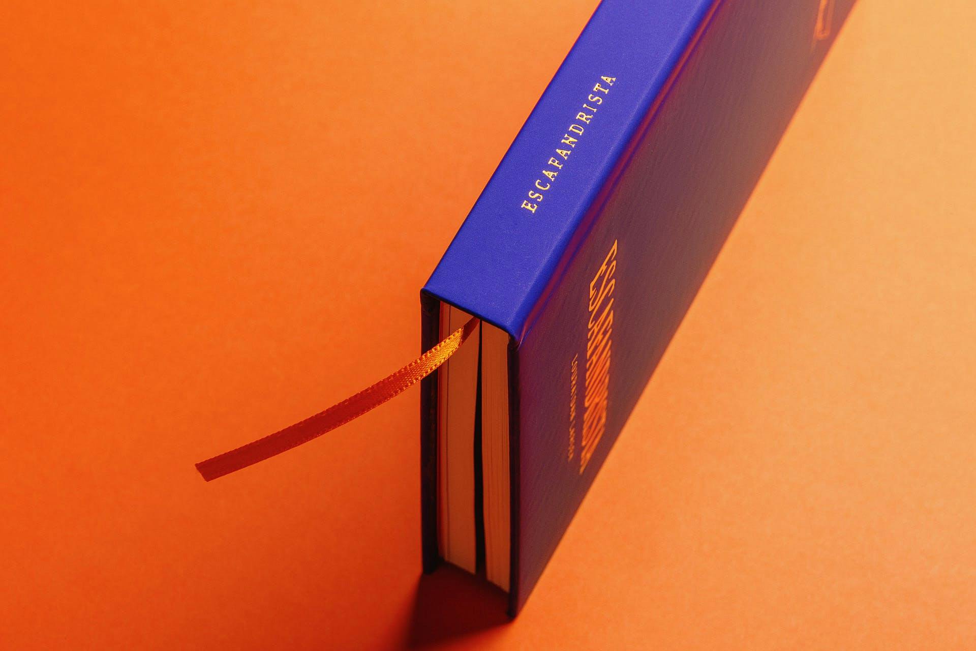
- Escafandrista
- Client
- Louraidan Larsen
- Agency
- Estúdio Lampejo
+View project⭑ Bronze at the Brasil Design Award (2021) - Editorial
The book Escafandrista brings together 144 chronicles written over ten years by the screenwriter and writer Louraidan Larsen. The stories were created from orality, from conversations the author holds with unknown people, from tales he hears on the streets and in public spaces. The book also has a preface by cartoonist Laerte Coutinho...
- Year
- Category
- Watercolor
- Project
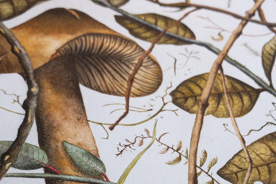
- Cogumelos são mágicos II
- Client
- –
- Agency
- –
+View projectThe diversity of the Fungi Kingdom is fascinating. These watercolors form a body of work that aims to exercise observation and composition of both existent botanical beings and imaginary ones. The peak of expression in this exercise lies, in particular, in the free combination of colors and in the almost microscopic detailing of textures and shapes...
- Year
- Category
- Watercolor
- Project
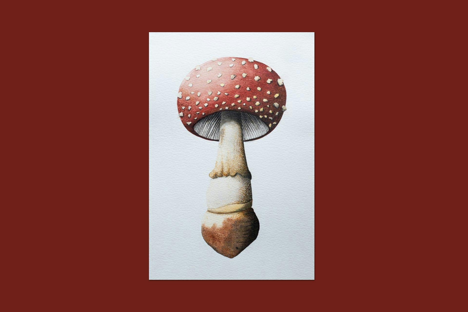
- Cogumelos são mágicos I
- Client
- –
- Agency
- –
+View projectThe diversity of the Fungi Kingdom is fascinating. These watercolors form a body of work that aims to exercise observation and composition of both existent botanical beings and imaginary ones. The peak of expression in this exercise lies, in particular, in the free combination of colors and in the almost microscopic detailing of textures and shapes...
- Year
- Category
- Authoral
- Project
- O 25º espetáculo
- Client
- –
- Agency
- –
+View projectOn April 3rd, 2020, Grupo Galpão would premiere its 25th play, directed by artists from Minas Gerais, Marcelo Castro and Vinícius de Souza, based on a immersion in contemporary Brazilian poetry. On March 18th, the collective decided to interrupt the rehearsals due to the advance of the Covid-19 pandemic that had just arrived in Brazil. Since then, the play has never premiered. This photo essay presents a little of what's left of the show's creation process that couldn't find its audience...
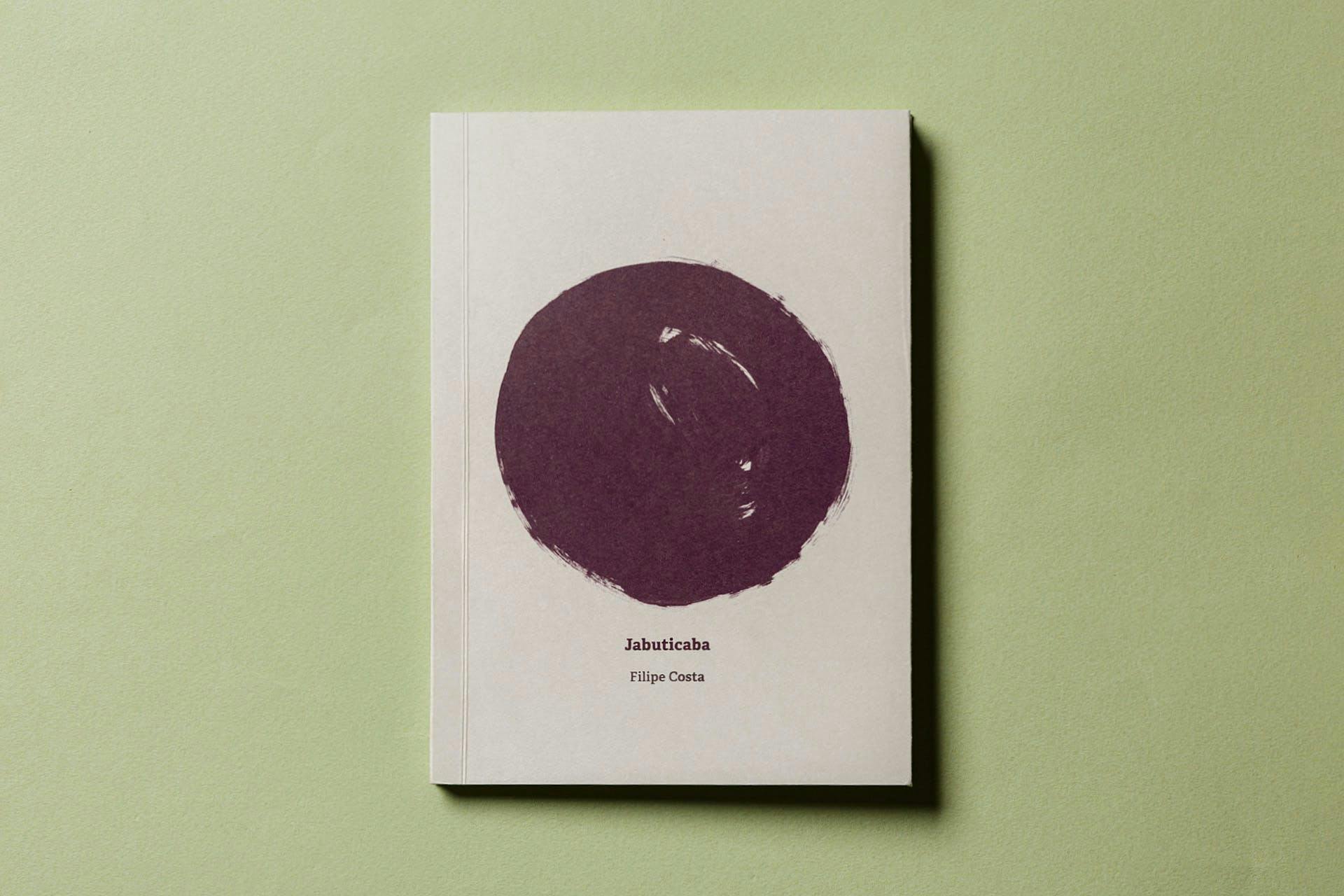
- Year
- Category
- Authoral
- Project
- Jabuticaba
- Client
- –
- Agency
- –
+View projectJabuticaba is my first auto fictional book and mixes photography and poetry. Similar to an artist's book or a diary, the publication presents fragments of a journey two friends took through the countryside of Minas Gerais. The work consists of 48 cell phone photographs, 2 whatsapp prints, 10 poems and 2 attachments...
- Year
- Category
- Editorial
- Project
- Idolatria e Masturbação
- Client
- Hugo Bento
- Agency
- –
+View projectIdolatria and Masturbação are short stories books by the psychoanalyst Hugo Bento. For Idolatria, we created a graphic project that puts the author's text in dialogue with the materiality of the object. Three guiding concepts were listed: Academic Normativity, Emptiness and Masculinity. The first translates into classical diagramming. The second is a game with text and sheet transparency. For the third concept, we have Davidson, a mechanical lathe operator that left grease marks on each copy, as inspired by one of the book's tales, 'Do Sangue à Graxa' (From Blood to Grease)...
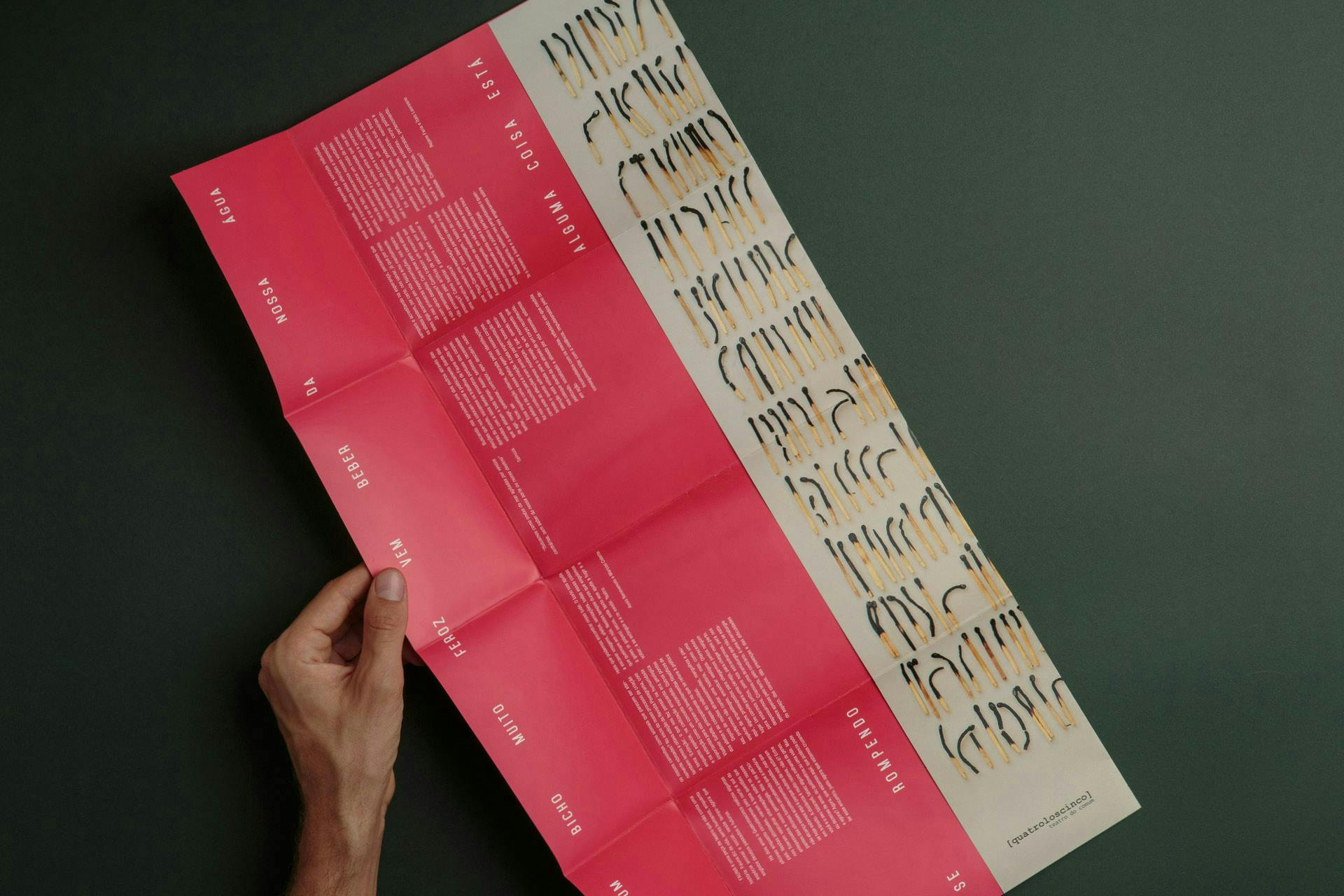
- Year
- Category
- Poster
- Project
- Fauna
- Client
- Quatroloscinco
- Agency
- Estudio Lampejo
+View project⭑ Project selected for the 12th Brazilian Biennial of Graphic Design.
To create the visual identity of the play, 543 matchsticks were burned and lined up. The goal was to create an image/metaphor to talk about the human species and its twilight. To talk about us: animals, strangers, diverse. Our similarities and differences. To talk about organization, systems, belonging, representation. To talk about time, about the traces of an event...- Year
- Category
- Editorial
- Project
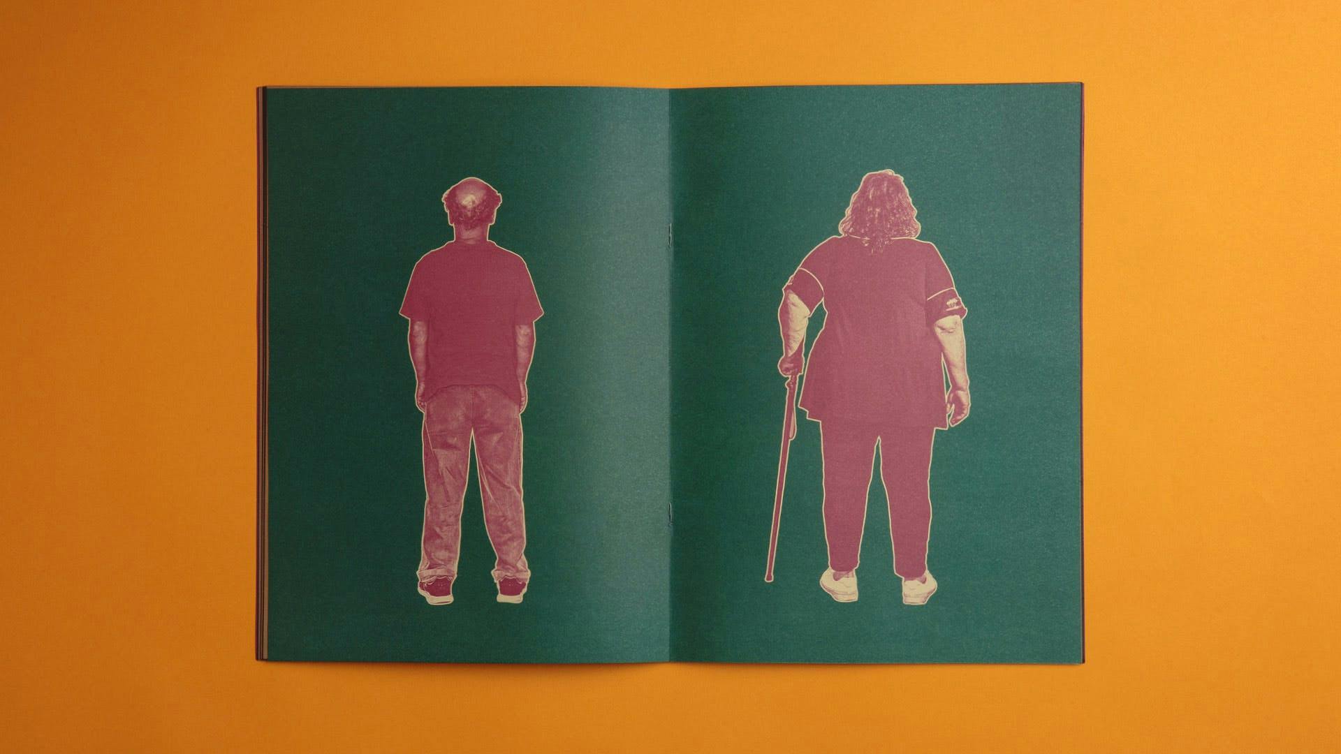
- Outros Grupo Galpão
- Client
- Grupo Galpão
- Agency
- Estudio Lampejo
+View projectThis publication organizes writings and images of the plays's design process. On the cover, a photo of a performance staged by the group in the context of the research. In the center pages, two company actors have their backs turned, as if they are going to meet each other...
- Year
- Category
- Visual Identity
- Project
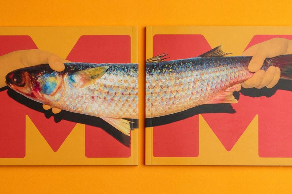
- Música Mundo 18th edition
- Client
- Música Mundo Festival
- Agency
- Estúdio Lampejo
+View projectFor the 18th edition of the project, we were invited to create a communication proposal with a strong visual appeal, capable of reconciling the fair's professionalism with the irreverence of the music scene. Under the motto "venda seu peixe", possibly translated to english as “make it happen”, we developed a wide system of visual elements that were articulated in dozens of digital and printed pieces, including graphic signage and set design...
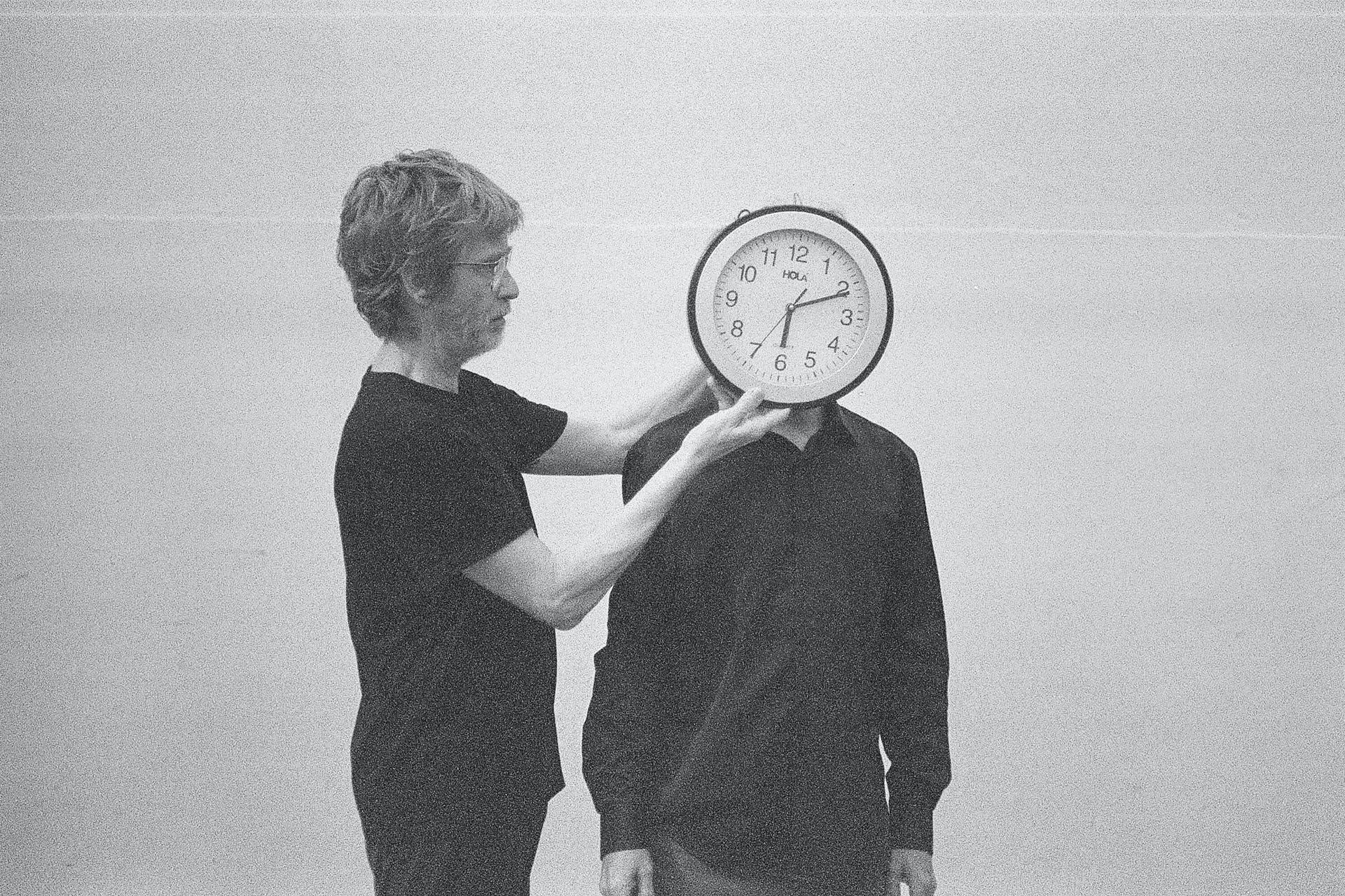
- Year
- Category
- Authoral
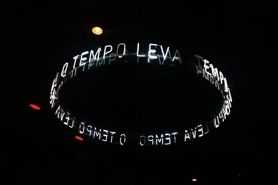
- Project
- Vagar
- Client
- –
- Agency
- –
+View projectVAGAR is a work originally created for the inauguration of the cultural and gastronomic project A Central, in the centenary building CentoeQuatro, which is part of the Praça da Estação Architectural Complex. The saying “O Tempo Leva Tempo” [Time Takes Time] was taken from one of my father's poems, the northeast poet, Murilo Gomes. I chose it because it abbreviates memories and imaginaries of the above-mentioned building where the work was conceived...
- Year
- Category
- Visual Identity
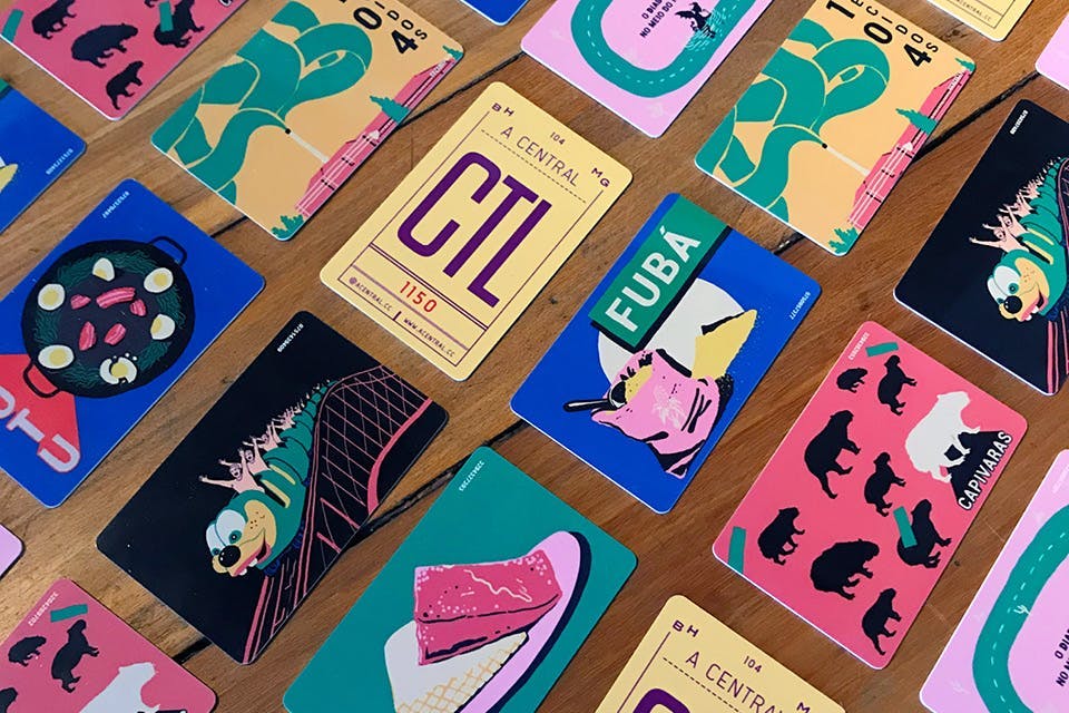
- Project
- A Central
- Client
- A Central
- Agency
- –
+View project⭑ Featured at the 13th Brazilian Biennial of Graphic Design (2019).
A Central was a restaurant and cultural space housed inside the CentoeQuatro: a historic building located next to the railway, built in 1906 to house one of the first industries in the newly founded capital of Minas Gerais. Since its inauguration, in 2018, A Central has become a relevant space at the intersection of gastronomy, architecture, design and culture in Belo Horizonte...
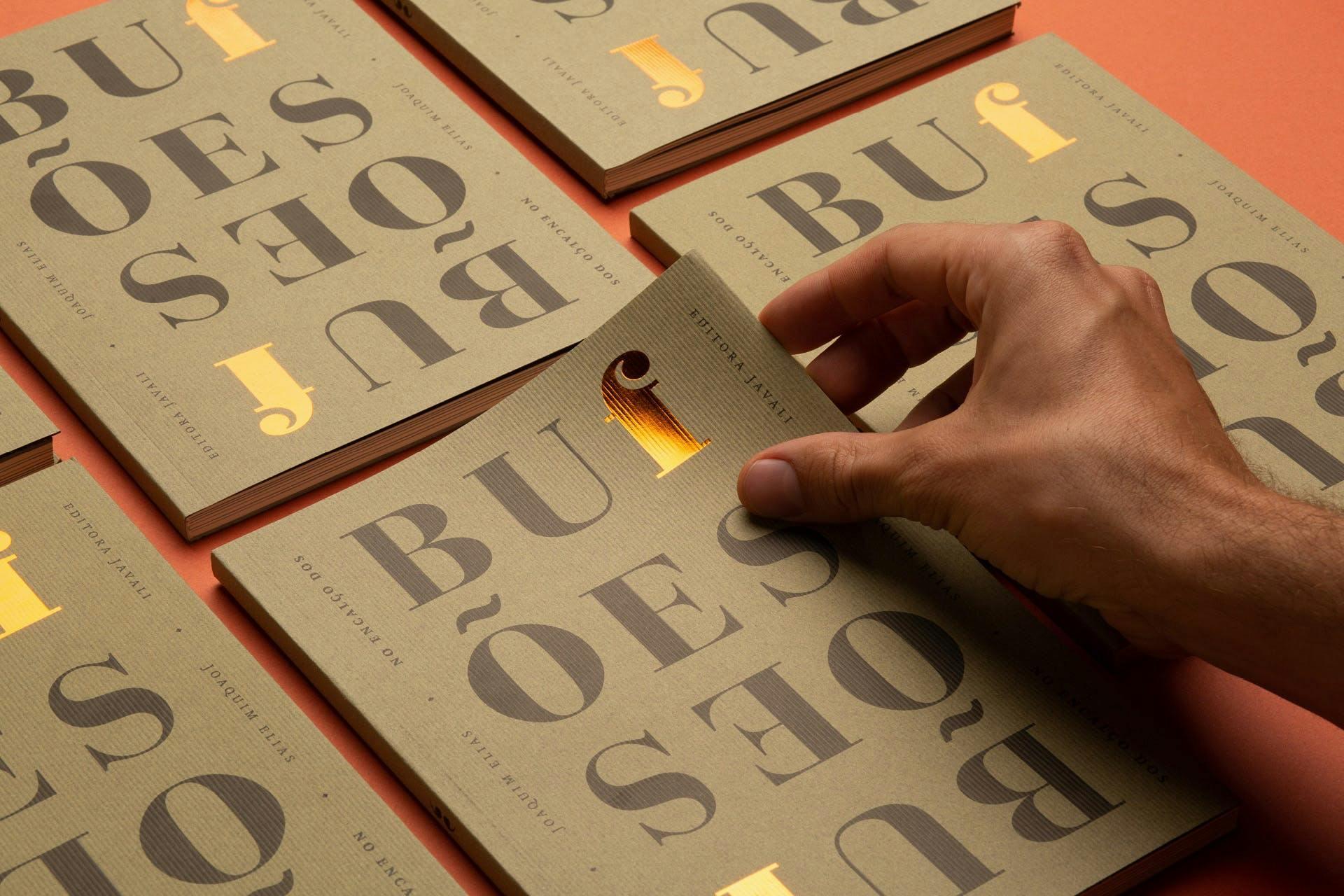
- Year
- Category
- Editorial
- Project
- Teste
- Client
- Editora Javali
- Agency
- Estúdio Lampejo
+View project⭑ Featured in Behance Editorial and Indesign categories
The editorial project should reflect the idea of disruption of order, thus exploring the psychological and historical portrait of the bufão. In addition to the mirror title, the publication has two identical covers that generate different reading possibilities and a certain disorder...
- Year
- Category
- Editorial
- Project
- No encalço dos bufões
- Client
- Editora Javali
- Agency
- Estúdio Lampejo
+View project⭑ Featured in Behance Editorial and Indesign categories
The editorial project should reflect the idea of disruption of order, thus exploring the psychological and historical portrait of the bufão. In addition to the mirror title, the publication has two identical covers that generate different reading possibilities and a certain disorder...
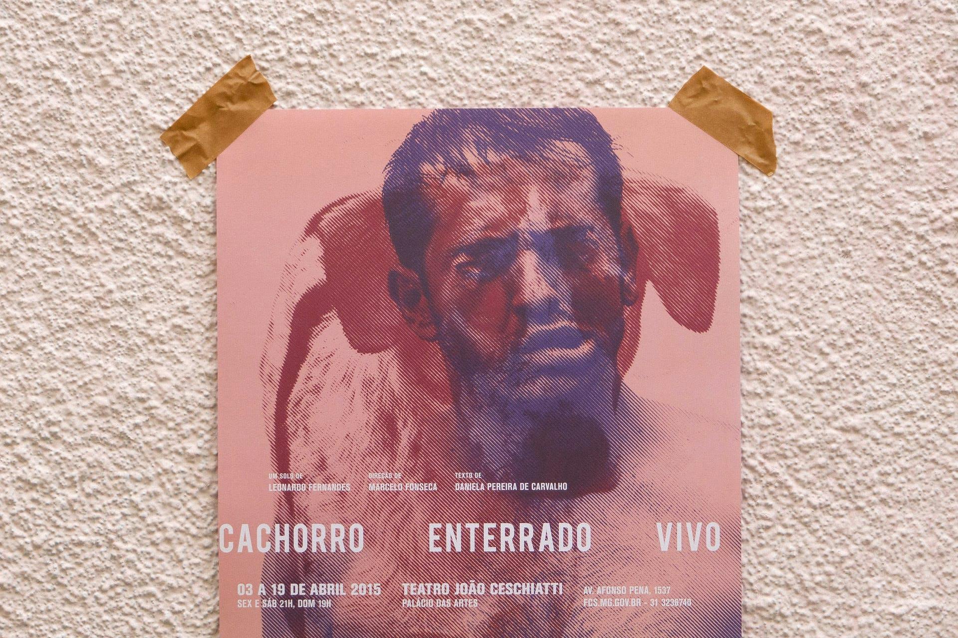
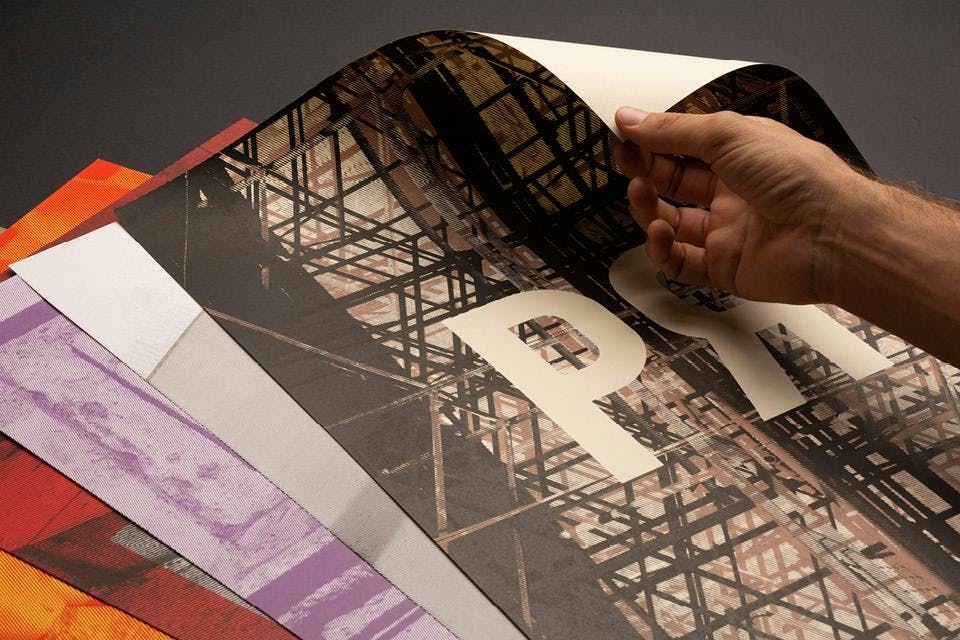
- Year
- Category
- Poster
- Project
- Cachorro enterrado vivo
- Client
- Leonardo Fernandes
- Agency
- Estudio Lampejo
+View projectPoster and show program for the play Cachorro Enterrado Vivo, by actor Leonardo Fernandes. Throughout the play, he embodies three characters to, through their points of view, tell the story of a couple and their dog. As we know the details of this relationship, we are confronted with the limits of human cruelty and irrationality...
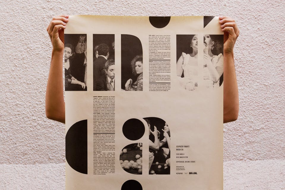
- Year
- Category
- Poster
- Project
- Ocupação Miúda Cia.
- Client
- Miúda Cia.
- Agency
- Estudio Lampejo
+View project⭑ Featured in the Behance Posters category.
The visual identity of the exhibition proposes a game with the proportion of the collective – numerous in the members but small in the name. The posters were screen-printed in the 76 x 112 cm format and covered with hundreds of adhesive circles. Then, they started to occupy several strategic and emblematic points of the city, interfering and creating new landscapes. The festival program was printed in the format 66 x 96 cm on newsprint and without folds...
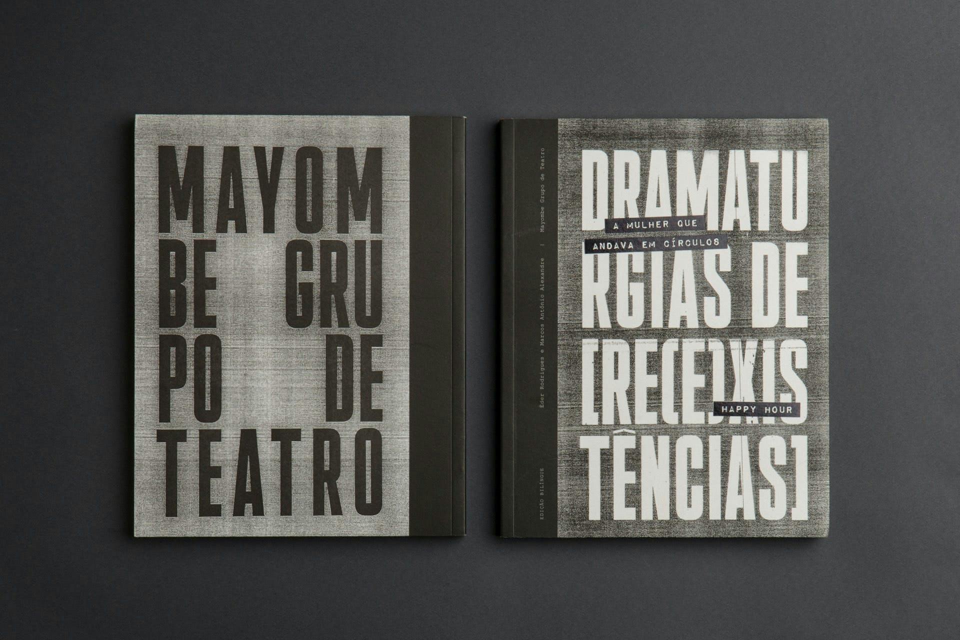
- Year
- Category
- Editorial
- Project
- Dramaturgias de [re(e)xistências]
- Client
- Eitora Javali
- Agency
- Estudio Lampejo
+View projectThe book’s graphic design project is organized around symbolic references to the published texts. The xerox, the typographic expression, and the black adhesive strips, widely used in documents, letters, and manifestos, establish a dialogue with the aesthetics and resources of the politics of resistance in Latin America. In opposition to the oppressive movements of erasure of memory, the project proposes to be an important archive in time...
- Year
- Category
- Editorial
- Project
- This is not a portfolio
- Client
- –
- Agency
- Estúdio Lampejo
+View projectThis is Not a Portfolio is a compilation of images created by Estúdio Lampejo, a design studio founded by me, over a four-year trajectory. This is not exactly a portfolio, but a larger cut of the way of imagining and living design, which encompasses not only the results, but its paths, its residues and – why not – its failures. The publication has a magazine format and has four different cover possibilities...
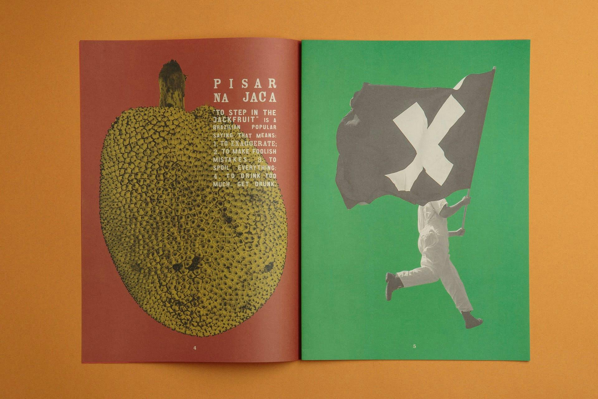
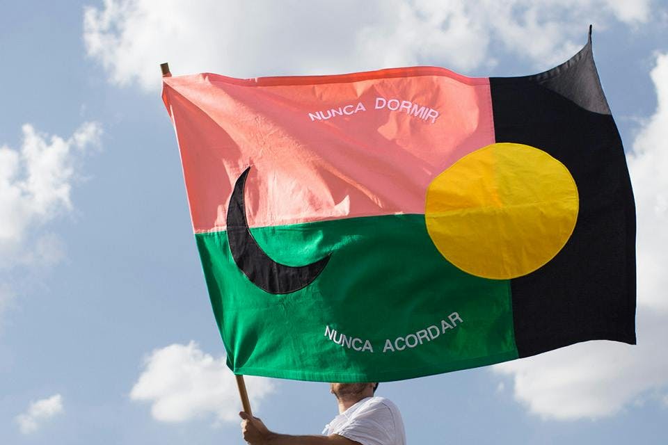
- Year
- Category
- Authoral
- Project
- Breves Bandeiras
- Client
- –
- Agency
- Estúdio Lampejo
+View project⭑ Exhibited at the first edition of the Bonde design festival in New York.
The project Breves Bandeiras had as its starting point the flags of cities, states, nations and associations, their role in everyday life and the principles that guide their creation. Thinking about them as a visual platform for creation seemed interesting to us because of their social meaning, their cultural connotations, and the process of creating and editing their forms...- Year
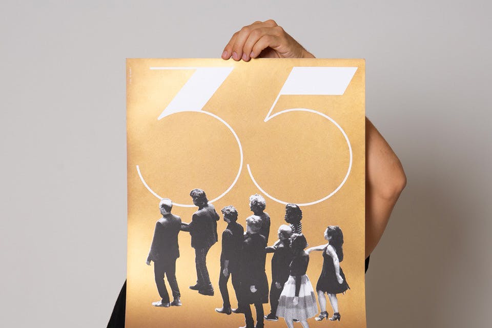
- Category
- Poster
- Project
- Grupo Galpão 35 Anos
- Client
- Grupo Galpão
- Agency
- Estúdio Lampejo
+View projectTo celebrate 35 years of the group's trajectory, we created the visual identity for the commemoration tour and a series of posters. Faced with this great celebration of Brazilian theater, we chose to create an original typographic design for the numbers applied in large proportions to the pieces. The delicate and geometric shapes merge with the halftone images and the star, which is the group's icon. The posters were printed in silkscreen in black and gold...
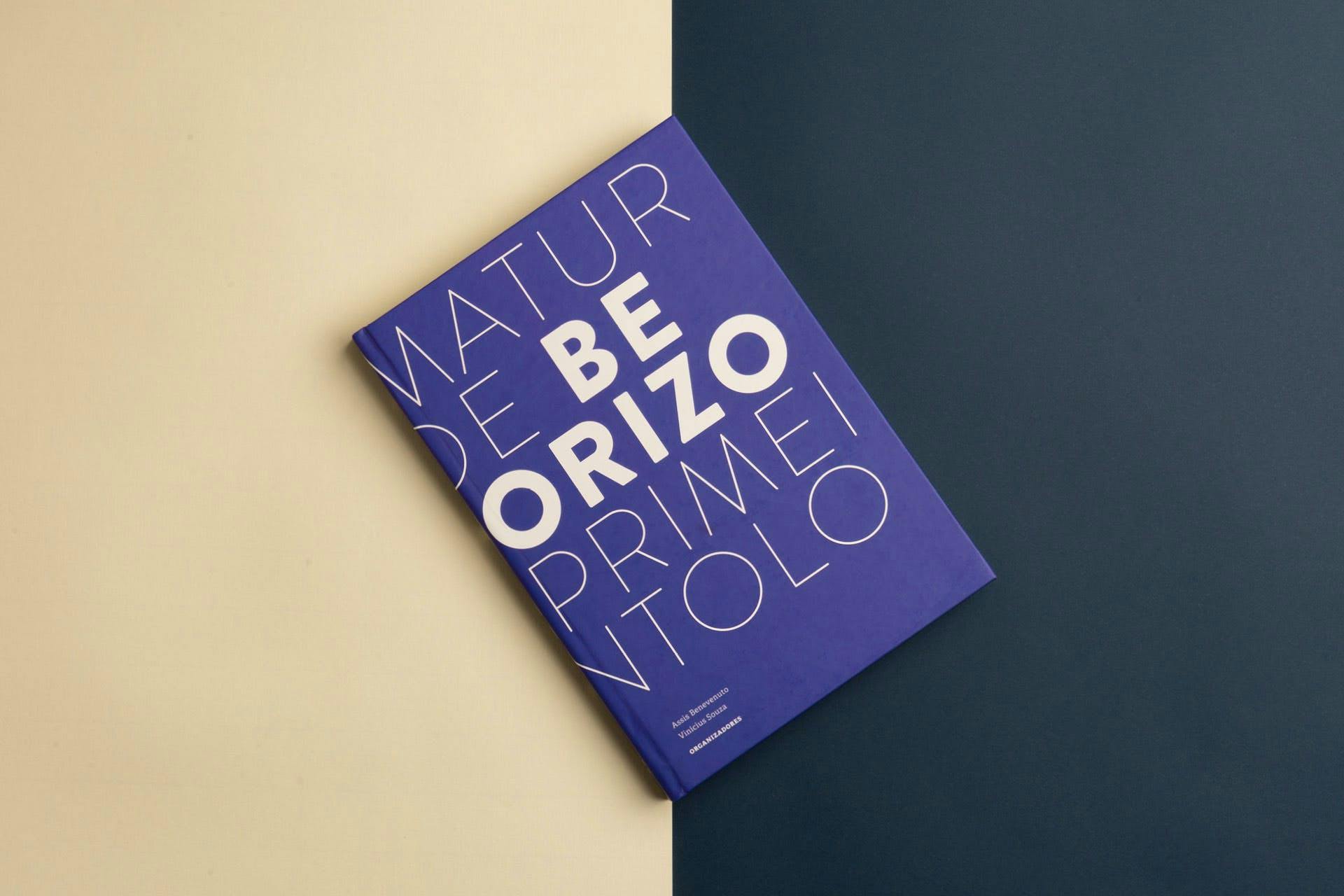
- Year
- Category
- Editorial
- Project
- Dramaturgia de Belo Horizonte Primeira Antologia
- Client
- Editora Javali
- Agency
- Estúdio Lampejo
+View project⭑ Featured in the Behance Editorial and Indesign categories.
The book Dramaturgia de Belo Horizonte: Primeira Antologia is composed of five seminal writings on the city's dramaturgy, written by authors from different generations and aesthetics. These are fundamental works that established new paradigms in Minas Gerais dramaturgy and gained great relevance among audiences and critics...
- Year
- Category
- Editorial
- Project
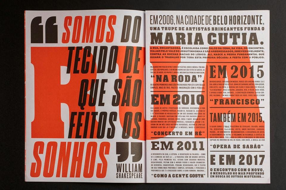
- Maria Cutia 10 Years
- Client
- Grupo Maria Cutia
- Agency
- Estúdio Lampejo
+View project⭑ Featured in the Behance Graphic Design category.
Since 2006, the Grupo Maria Cutia has been based in Belo Horizonte and dedicated to research on street theater. To celebrate the group's 10th anniversary, we created a visual identity inspired by popular urban posters. Similar to these media, the work consisted of a diverse typographic composition, creating a texture of juxtaposed information...
- Year
- Category
- Editorial
- Project
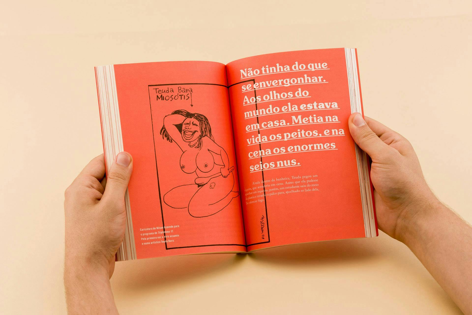
- Teuda Bara – Comunista demais para ser chacrete
- Client
- João Santos
- Agency
- Estúdio Lampejo
+View project⭑ Featured at the 12th Brazilian Biennial of Graphic Design (2018)
The work draws a biographical profile of the mythological actress from Minas Gerais, largely renowned for her trajectory with Grupo Galpão. The book is the result of a long process of research and living with the actress, which involved afternoons at her house, rummaging through folders and drawers. More than a formal biography, this project aims to translate Teuda's irreverence and charisma, trying to offer the reader a fluid experience that is as visually rich as her stories..- Year
- Category
- Poster, Visual Identity
- Project
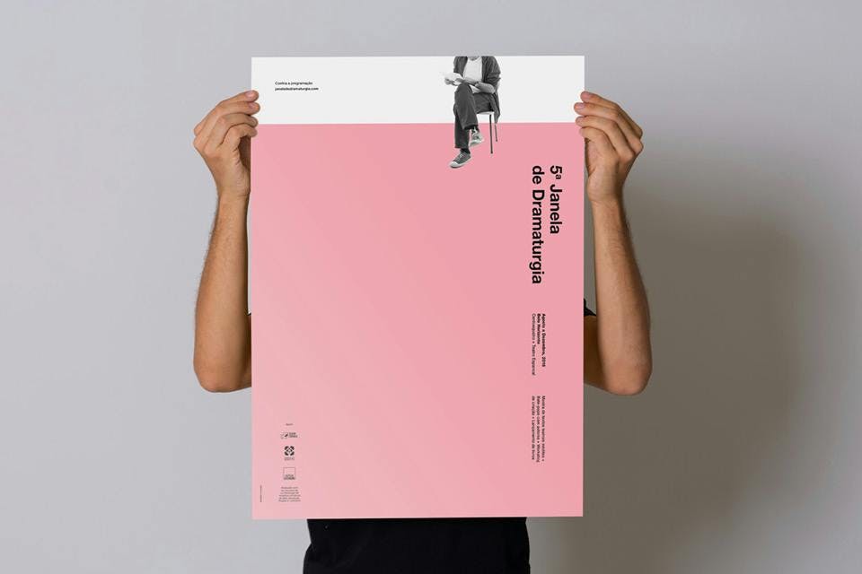
- Janela de Dramaturgia 5ª edição
- Client
- Vinícius de Souza
- Agency
- Estudio Lampejo
+View projectThe visual identity proposal for the fifth edition was based on the maximum representation of the gesture of reading: a seated person holds a text in their hands. The usage of pink overflowing the edges of the graphic pieces creates a spatial relationship of amplitude and of lack of reference points. Similar to the act of reading texts, this visual strategy opens doors to the unknown and to other worlds. It is also not possible to identify those who read: the intentional clipping of the images sheds light on the power and delicacy of the notion of reading...
- Year
- Category
- Editorial
- Project
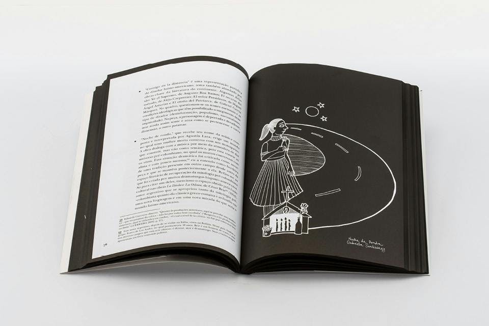
- Teatro Latino-Americano em Diálogo
- Client
- Editora Javali
- Agency
- Estudio Lampejo
+View project⭑ Featured in the Behance Editorial category
One of the challenges in creating the book was to graphically translate the concepts used by the author to think about theater and politics in Latin America. The line drawing of the juxtaposed maps was engraved on the cover, symbolizing the border relations and dialogue between countries. Along with this tactile effect, the audacious option for the absence of color reinforces the provocation about (in)visibility, another key concept in the creation of the project...
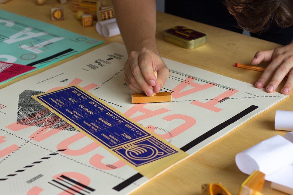
- Year
- Category
- Poster, Visual Identity
- Project
- Chá com Cartas
- Client
- Ramon Brant
- Agency
- Estúdio Lampejo
+View project⭑ Featured at the 12th Brazilian Biennial of Graphic Design (2018).
The challenge in this project was to translate into graphic pieces the sensory experience of writing, communicating actions in a versatile and cheap way. The poster series was created in three steps inspired by the layers of graphical information that a mail receives before it is mailed. In the foreground, printing directly on the media. Then, gluing adhesive labels and stamps...
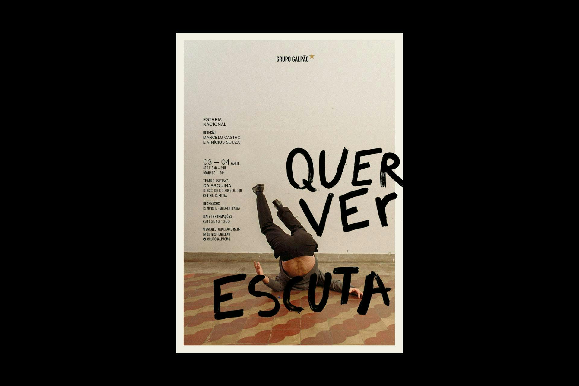
- Year
- Category
- Poster, Visual Identity
- Project
- Quer ver escuta
- Client
- Grupo Galpão
- Agency
- –
+View project⭑ Gold at the Brasil Design Award (2021)
The origin of Grupo Galpão is linked to the experimentation of languages. We were interested in thinking about design as a creative tool in the creation of the play, which in turn had the objective of taking the word off the paper, giving it body and voice, color and form. We proposed graphic experimentation exercises for actors, with a lot of freedom in writing and drawing, inspired by poems and by the title of the play. We organized photo shots motivated by the performativity exercises they had been working on...
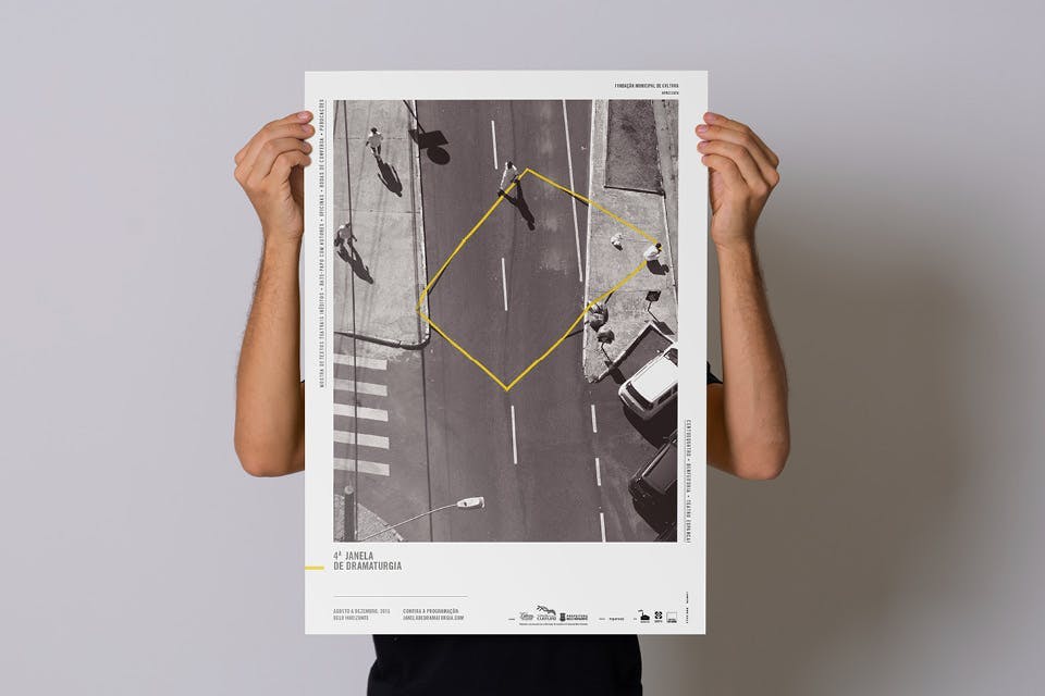
- Year
- Category
- Visual Identity
- Project
- Janela de Dramaturgia 4ª edição
- Client
- Vinícius de Souza
- Agency
- Estudio Lampejo
+View projectFor its fourth edition, the visual identity reflected the event's growth, deepening its dialogue with the city from the perspective of “expanding landscapes”. The graphic proposal was organized around the documentation of urban interventions created by Estúdio Lampejo. In these interventions, dressed-up workers marked out cuts in urban landscapes using a yellow signaling tape...
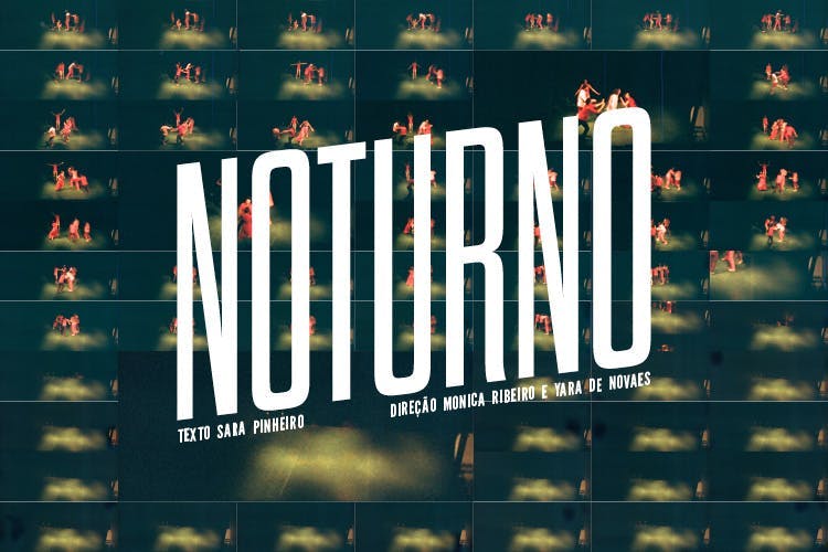
- Year
- Category
- Poster
- Project
- Noturno
- Client
- Teatro Invertido
- Agency
- Estúdio Lampejo
+View projectThe development of the visual identity of the show took as its starting point analog photographs that were taken during the rehearsals. The camera simulates a movement in the image through the frame sequence. The work with intense and blurred color photos reveals a climate of saturation and uncertainty, pointing to the imminence of a near and inexorable future. The font used for the title alludes to science fiction posters. The play's program works like a flipbook and recreates the anguish and movement of the characters towards the unknown...
- Year
- Category
- Poster
- Project
- Teatro Invertido 10 Anos
- Client
- Teatro Invertido
- Agency
- Estúdio Lampejo
+View projectOn the company's 10th anniversary, we were invited to create a series of commemorative posters that would translate the close relationship between the group and the city. The photographic images reveal some subtleties: from the concrete of the emblematic Praça da Estação to the remaining wall of a house demolished in the process of removals for the expansion of an avenue...
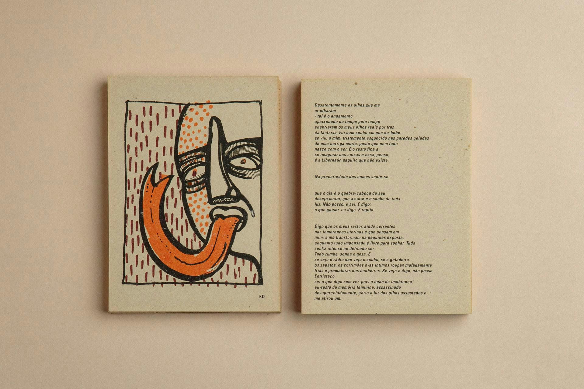
- Year
- Category
- Editorial
- Project
- Para-me Gritoção
- Client
- Assis Benevenuto
- Agency
- Estúdio Lampejo
+View projectGritocão is the third book of poetry by the actor and writer Assis Benevenuto. The work was conceived from the dialogue between the author and six different artists, invited to freely illustrate the author's poetry. The craftsmanship of the process and the search for alternative printing materials are fundamental aspects of the work. The book is printed in two colors and consists of individual cardboard sheets, like postcards...
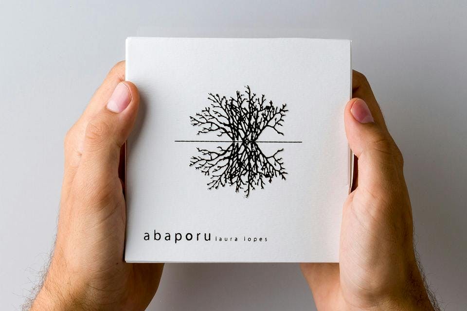
- Year
- Category
- Music album
- Project
- Abaporu
- Client
- Laura Lopes
- Agency
- Estúdio Lampejo
+View project⭑ Project nominated for the Latin Grammy 2013 - best graphic design project.
The graphic design of singer Laura Lopes' first album was inspired by the delicacy of the lyrics and arrangements, alluding to concrete poetry. It also features illustrations made by artist Ana Rocha, in a process that combined the production of stamps and the use of typewriters...